Case study 04 / 04
NKNZ Studio
Personal studio concept · work in progress“Neither less nor more.” A creative-studio site exploring typography, composition and scroll-driven interaction.
- Role
- Designer and frontend developer (personal project)
- Timeline
- 2026 · Work in progress
- Stack & tools
- Next.js · Cloudflare Workers · Inter Tight · Jost · Scroll-driven motion
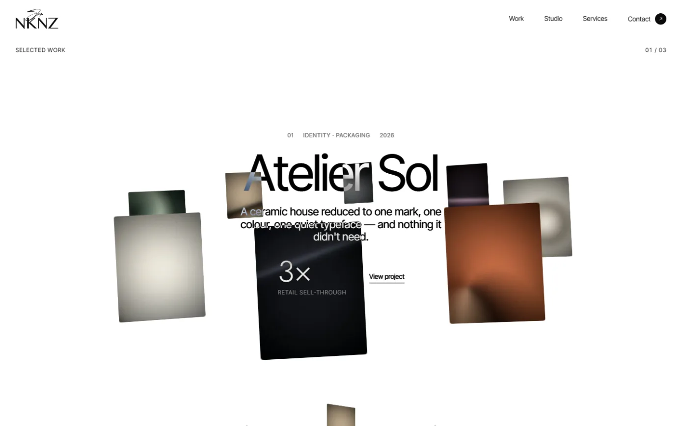
A studio website I'm designing and building myself — visual direction, typography, layout, interaction and the Next.js implementation. It's a work in progress, and the projects shown on it are illustrative.
01
Overview
NKNZ is a design-studio website built around one line: “Design that says exactly enough. Neither less nor more.” It presents an independent studio for brand identity, digital design and development, art direction, and spatial and packaging work.
I'm designing and building it myself. It exists to show the part of my work that isn't product logic: visual judgement, typography and composition, and interaction that feels considered.
02
Context
Status: work in progress. The ‘Selected work’ entries on the site — Atelier Sol, North House, Field Notes, and three more — are illustrative content written to exercise the layouts. They are not client engagements, and any figures that appear alongside them are placeholders, not results.
03
Problem
Most studio sites either say too much (case-study walls, stats everywhere) or too little (a logo and an email). The brief I set myself: let the typography and the rhythm of the page carry the studio's idea, and make every interaction earn its place.
04
My role
- Design direction, visual language and typography.
- Layout, composition and interaction design.
- Frontend implementation in Next.js.
- Deployment on Cloudflare Workers.
05
Approach
Reduction as the method. Start with a type system and a white page; add only what the content needs. Motion is used to pace the reading — revealing one project or one service at a time — rather than to decorate.
06
User experience
Typography and the opening statement
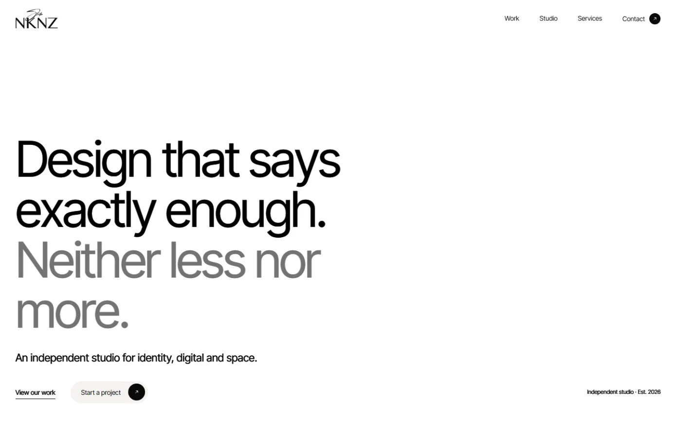
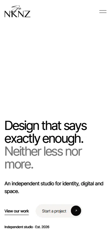
The home page is almost entirely type: a very large, tightly set Inter Tight statement that shifts from black to grey on “Neither less nor more.”, a single line describing the studio, and two actions. The signature NKNZ wordmark is the only ornament.
Layout, composition and motion
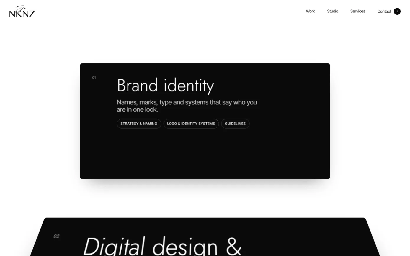
Selected work is a pinned, scroll-driven sequence: one project title at a time, centred, while tilted image cards drift through the frame around it. Services use stacking cards that slide over each other as you scroll, with a light italic shift on each title as it settles.
Navigation and interaction
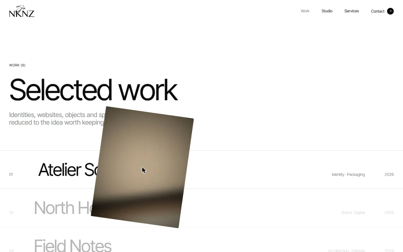
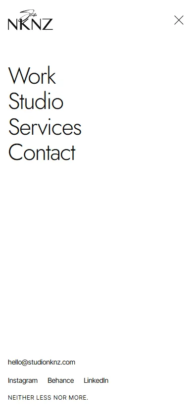
The work index is a typographic list; hovering a row brings in a tilted preview that follows the cursor. On mobile, navigation becomes a full-screen menu set in Jost, with contact details anchored at the bottom.
07
Design decisions
- Two typefaces with clear jobs: Inter Tight for statements and body, Jost for service titles and the mobile menu.
- Black, white and one grey. Colour comes only from imagery, so composition does the work.
- One idea per viewport. Pinned sections stop the page from becoming a wall of cards.
- Motion tied to scroll position rather than timers, so the reader controls the pace.
- Accessibility basics from the start: a skip-to-content link, real links and headings, and a usable layout without hover.
08
Technical implementation
- Next.js, built with Turbopack.
- Deployed to Cloudflare Workers.
- Self-hosted Inter Tight and Jost with fallback metrics to limit layout shift.
- Scroll-linked transforms for the pinned work sequence and the stacking service cards.
- Responsive layouts designed separately for mobile rather than scaled down.
01
Type system & layout
Inter Tight, Jost, one grey
02
Next.js
Pages, components, scroll-linked motion
03
Cloudflare Workers
Deployment at the edge
04
Browser
Responsive layouts, reduced chrome
09
Key challenges
- Keeping scroll-driven motion smooth and readable without hijacking scrolling.
- Making very large type behave across breakpoints without awkward line breaks.
- Designing a mobile experience that keeps the same restraint, not a squeezed desktop.
10
Outcome
A working, deployed site that I'm still refining. The value for this portfolio is the craft itself: it shows how I think about type, space and motion when no product requirement is telling me what to do.
11
What I learned
- Removing things is a design skill that has to be practised on purpose.
- Motion reads as quality only when it explains structure; otherwise it reads as noise.
- The same discipline transfers to product UI: fewer, clearer choices per screen.
Next case study
Nazarana Silver